Having a logo is also essential to stand out among your competitors. Pleasing aesthetics naturally attract people, so a well-designed logo creates a sense of trust in people regarding your brand. Brands with a popular logo have taken this into consideration during the design process because a flimsy design does nothing but reflect the unprofessionalism of a business.
Another example that best explains the importance of brand logos is to consider how international conglomerates have created brand loyalty because of the consumer sentiments attached to their logos. For someone, Nike’s swoosh could represent comfort and fashionable style, whereas others may disagree with it and associate these meanings with some other brand. Alternatively, the same person may hold another brand logo in high regard for different qualities, looking at the Adidas logo as a reflection of their sporty and sturdy shoes.
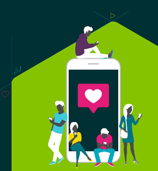
Speaking of social media platforms, their logos have also allowed these brands to create a brand identity that reflects their values and culture. Let’s have a look at the logos of the 7 most popular social media platforms and learn how they’ve originated and evolved over the several years:
1. Facebook
Facebook’s logo has the most interesting origin story among all the other social media logos. Among designers, it’s known that blue is a soothing color representing purity and optimism. However, the reason behind the color choice does not simply stem from color theory.
Mark Zuckerberg chose blue as the primary color for Facebook because of his disorder, called deuteranopia, which made it difficult for him to perceive colors, except blue.
Over the years, despite the numerous changes made to the logo, Facebook has been consistent with blue as the background to the white-colored ‘f’ alphabet in its logo. The reason behind the lower-case alphabets in its wordmark could likely be an attempt at representing the platform as a place to have fun and chat casually with friends and family.
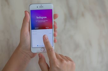
2. Instagram
Kevin Systrom founded Instagram on Oct 6, 2010. It was initially launched as an iOS-only app and became an instant success with 100,000 downloads in a week. As an iOS-only app, the inspiration behind its logo design was Apple’s then-popular skeuomorphic icon design; thus, the original Instagram logo was much more colorful looking.
Later on, when Facebook acquired Instagram, the logo eventually changed to a gradient icon with a simple camera outline. This rebranding was not instantaneous, but four years after acquiring the company, the changing features and advancements made to the app called for a new look.
3. WhatsApp

WhatsApp founders Brian Acton and Jan Koum were former Yahoo employees. After leaving the company, they applied for job vacancies at Facebook, but their applications were not accepted. Eventually, in 2009 WhatsApp came into inception as an app that provided free calling and messaging services to its users.
One reason why people liked the app was that, unlike skype, WhatsApp did not require its users to repeatedly log in for use. Instead, with its always-on, easily accessible app, it became an alternative to the default messaging system.
The WhatsApp logo represents this simplified nature of the app, sporting a chat bubble with a traditional telephone in the middle of it. The choice for using green in the icon might be out of spite for the popular use of blue. Having been rejected by Facebook, they may have wanted a fresher and crisp look for the logo, which they successfully achieved with a green and white color combination.
A more plausible reason for this could be the science behind the usage of green, from traffic signals power-on buttons to call-picking icons. While most people may not consider it a social media app, the group messaging and calling options definitely makes it fall in the social networking category.
4. Twitter
One of the top micro-blogging and social networking platforms, Twitter has one of the most distinct logos depicting a blue-colored bird. According to Statista, in 2021’s second quarter, Twitter had 206 million daily active users globally. Thanks to its popularity among celebrities, it has amassed a large user base. One of the most followed profiles on Twitter is the former U.S. president Barack Obama.
Initially, Twitter had a very different name and logo when it launched in 2006. Its original name, twttr, was inspired by the US photo-sharing platform Flickr. Noah Glass, the platform co-founder, was the first to create a prototype logo for the micro-blogging platform. As someone who did not have proper training in graphic designing, the outcome of this mock-up design was nothing short of a disaster.
Thankfully, for the website's official launch, the logo was all set to change. The co-founders hired Linda Gavin to recreate the logo within a day’s deadline. Later on, her successful design stayed the same till 2010. This was the time when the bird was added to the logo. Previously, Twitter had tried using multiple other options for featuring an animal on its logo, but they all failed. The bluebird, however, became a mainstay for the brand. Also known as Larry the Bird, it changed in 2012 with a more simplistic bird design created by Douglas Bowman.
Today, the symbol is so popular that one does not even need to mention the word Twitter. Besides that, the design is also much more effective, depicting a bird that seems to be soaring higher. The positive connotation makes it better than the Larry the Bird version.
5. TikTok
TikTok has become a nightmare for its competitors despite being late to the social media party. It has rapidly gained a large user-base of Gen Z and Millennials, all thanks to a design that features non-stop videos that keep users engaged. Moreover, its algorithm prefers to promote newer talent, which makes it easier for newcomers to make it big quickly. This incentivization has played a significant role in its success.
The fact that its design has not changed since its popularity shows that the unknown logo designer of TikTok must have done an excellent job at it. Its neon shades of white, blue and red give a very disco feel to the icon. The use of a musical note indicates that the app portrays itself as a platform where users can have fun making videos with background music and cool filters.
6. LinkedIn
Also known as “Facebook for Professionals,” LinkedIn is famous for creating a social networking space for its users to build business connections and share like-minded informative and educational content. Launched in 2003, it is the oldest platform on our list. Indeed, its business model has allowed it to stay on the top without losing its popularity as much as other platforms have due to high competition.
Given its business nature, LinkedIn uses a very simplistic logo design that has remained consistent since its early days, only changing the word “Linked” from black to blue with “In” written in white over a blue round-cornered box. For a shorthand of the brand name, LinkedIn only uses the latter part for its app icon.
7. Snapchat
Formerly known as Picaboo, an app founded by three people, Snapchat’s logo sported a white ghost sticking its tongue over a yellow background. This design perfectly encapsulated Reggie Brown's idea of creating an app with disappearing messages. The credit for designing the Snapchat logo goes to one of the other two founders, Evan Spielberg, who designed it on his home computer without any formal graphic designing education. Today, the worth of its logo is estimated at 25 billion dollars.
Over the years, the app has had only three revisions to its logo, with the difference of only a thicker outline between the second and third variants. According to Evans, during his research, he noticed the rarity of yellow color among app icons which led him to choose the color. Given that it’s a color representing happiness and is also quite bright, making it pop out among other logos, it was a wise choice and certainly helped the app attract more users.
Final thoughts
Having discussed the importance of logos in creating a brand identity, it’s safe to say that the public opinion around a brand can create an inherent value for a logo, which can be many times more than its actual cost price. Earlier in the introduction, we discussed Nike’s swoosh. You’d be surprised to know that today, the worth of that logo is more than $30 billion, while its creator Carolyn Davidson, was only paid 35$ for designing it in 1971. Thus, the branding combined with a good design is what creates an invaluable asset.
Access the latest business knowledge in Marketing
Get Access


Anas Hassan
Anas is a design consultant at leading graphic design agency Logo Poppin. He has a vast experience of providing logo design services and digital marketing strategies. Beside this, he is an avid football fan and enjoys an occasional steak dinner.


Comments
Join the conversation...