
In this article we share some of the lessons we’ve learned from managing an annual seven-figure online marketing spend.
1. Optimize your website for mobile visitors
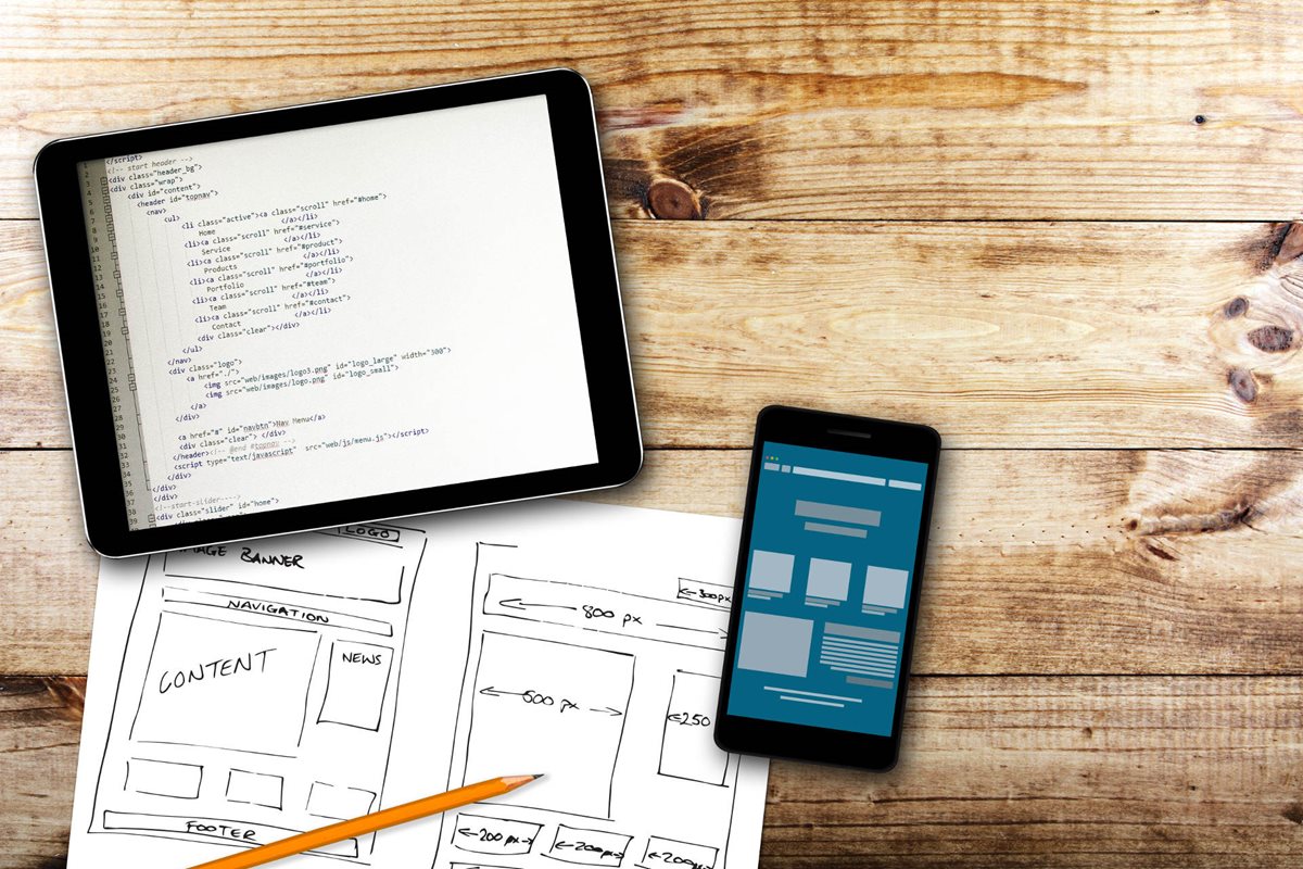
With more than 50% of website traffic coming from mobile visitors, and often as much as 70%, the first point to make is that you absolutely must consider the journey of your mobile visitors as a priority.
Whilst many people look at their website on a desktop on an almost daily basis, they rarely do so on their mobile phone. This can be a very costly mistake. Look at your website on a mobile and see it as your visitors see it.
Test each link that you find to ensure they are working as intended.
Most importantly, ensure that your telephone number is always hyperlinked in your call to action to make it as easy as possible to call you. You can test this by simply touching the screen where your telephone number appears, if it is linked properly a message will pop up inviting you to “Call” the number.
2. Always include a call to action
Following on from the point above, one of the biggest mistakes that most businesses make is to fail to include a call to action at the end of every page on their website.
The call to action explains exactly what your website visitor should do next to progress the in their relationship with you.
It might be to call you, email you, buy your product or service or simply download your lead magnet. Whatever it is, you must ensure that your call to action is included at the end of every page.
You cannot expect your website visitors to hunt around your website for your contact details, they simply won’t bother. With most visitors only looking at one or two pages on your site on average, you need to make it as easy as possible to get in touch with you, so a call to action at the end of each page is essential.
We have seen this simple website change increase conversions by as much as 500%, so it is well worth taking the time to ensure that each of your pages ends with a call to action.
3. Only have one purpose per page
It is extremely important that you know exactly what action you would like your visitor to take at the end of every page, and then once you know that that your call to action tells them how to do this.
For example, on some pages your purpose may to ask your visitor to contact you, whether via email, your enquiry form or telephone. That would be your one purpose on that page.
On other pages, you might want your visitor to download a book or free video course. That is your one purpose.
Far too frequently we see websites that don’t have their one purpose defined for that page. This simply leads to confusing the visitor. After all, if the website doesn’t know what they want their visitor to do on the page in question, how is the visitor supposed to know?
4. Keep your website design simple
The best converting websites are often not that pretty. They might not appear attractive or visually stunning. However, they are simple to use and make it incredibly easy to contact the business.
We see far too many website owners being led by a website designer whose only aim is to create a truly original piece of art.
Sadly, for website designers, simplicity works so much better than art when it comes to creating a website that converts.
You should avoid extremely large header images, which prevent the visitor from reaching the content without scrolling past the fold. Instead, a small image allowing a visitor to see both the image and the start of the content when they land on your website, whether from a mobile or a laptop, will work much better.
5. Create interesting copy
We will end with perhaps one of the more contentious yet proven points.
If your website doesn’t have enough words on each page, no one will ever find it and even if they do, they won’t contact you.
It is the words that persuade someone to make contact with you rather than the images or colors.
What’s more, without a significant volume of words on each page (a minimum of 400 but as many as 2,000) search engines won’t identify you as a valuable source, and so you’ll appear further down the SERPs.
The search engines’ spiders need to be able to read each page to assess what they’re about. The more words you have on each page, the easier it is to understand what the page is about, list the page in their search engines and send you lots of prospects who are hungry for your products or services.
You can always break the words up (and you should do) with small images (right aligned so as not to break the flow of the copy), bullet points, headings and sub headings.
Don’t let your designer stop you putting enough words on each page to ensure that your website attracts enough visitors and converts a good number of them into new clients for you.
Access the latest business knowledge in Marketing
Get Access

Nick Jervis
Nick Jervis is a former solicitor who since 2003 has provided marketing consultancy and marketing services for the owners of service businesses.
Comments
Join the conversation...