
When this happens, visitors tend to leave the site immediately - it’s far simpler to find a site that is easier to navigate than to try and figure out how the site is supposed to work. For some demographics, such as senior citizens, the visually-impaired, or just those with low tolerance for technological frustrations, the bar is very low for what makes a website difficult to use.
When a website is designed for maximum user-friendliness, conversions can increase dramatically. A study by the Nielsen Norman group found that ensuring that senior citizens had the same user experience as other visitors could potentially increase sales by up to 35%. There are a few key factors that all web designers can incorporate to make their site easy to use for most people. Read on to learn about some of the most important user-friendly web design factors and see examples from real websites.
Create Simple Navigation
Few things are worse than coming across a website that seems impossible to navigate. Failing to optimize your site for easy navigation can have disastrous consequences that will plague your business. The navigation bar at the top of the page is the most important element of navigation: it is your opportunity to direct your visitors to the most important parts of your site. For the most user-friendly experience, lock the navigation bar so it is always visible, no matter how far a visitor scrolls down.
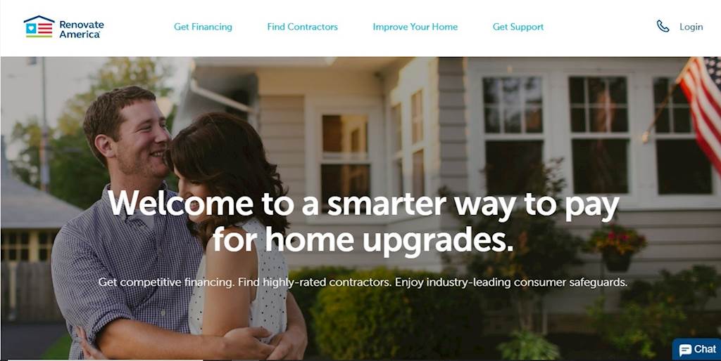
Renovate America is an excellent example of a user-friendly navigation bar. It remains at the top of every web page, and there are only four listed categories that are specific to what a visitor might be searching for.
A website should flow effortlessly and allow the user to stick to their intended task with minimal interruption. Pop-ups, moving website parts, and extensive navigation menus can distract or annoy visitors and cause them to leave your site. While there are certainly uses for these website elements, they should be used cautiously and with a specific purpose. A clear exit path is also essential to allow the user to carry on with the task at hand.
Use Vibrant Colors
Color may be the most attention-grabbing element of your site design. It can inform your visitor’s decision to stay or leave before they even read a word of what you’ve written - one study found that up to 90% of initial website judgments can be based exclusively on color choice.
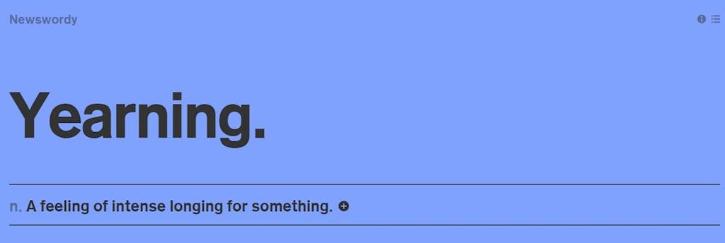
Using vibrant and/or high contrast colors will make it easier for visitors to navigate through your website. Attractive colors can also catch the attention of visitors who happen upon your site by accident. This example from Newswordy shows how one bold color can immediately catch your eye.
But don’t think that layers of vibrant color are the key - white space is equally important. It’s best to keep color palettes simple, but bold. A monotone palette featuring different shades of one color provides many opportunities for high-contrast design, as does a palette with two complementary colors. Proceed with caution when adding colors, however, as clashing colors or too many shades can do more harm than good. Check out this article for more examples of vibrant color use.
Use Readable Fonts
Tiny and nonstandard fonts make it difficult for people to identify and absorb the information they need to make an informed decision. Incorporating a way for people with vision problems - or just those who don’t feel like squinting - to comfortably read your website is a simple way to make your content more accessible to all. It’s also important to be compliant with the Americans with Disabilities Act (ADA), which has guidelines for making webpages accessible for visually-impaired users.
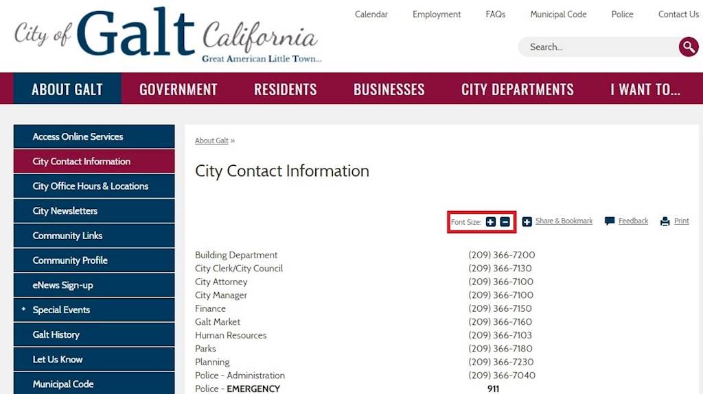
Text that is too big requires endless scrolling, while text that is too small is frustrating to read. Ideally, websites should use no less than 12-pixel font by default. You can also use responsive web design to ensure that your layout is not disrupted if a user magnifies text or accesses your site from a different device. If possible, you can also incorporate a tool for text magnification on your page like the City of Galt.
Font style is also an important factor, as fancy or complicated fonts can drastically impede readability. Vieo Design has a great resource on choosing a web font.
Break Up Long Blocks of Text
Long, boring paragraphs or large blocks of text are potential turn-offs for a customer. Visitors want information in a digestible form, which is why it is always advisable to break down information into smaller chunks. Using numbered lists and bolded headings and subheadings makes it easier for your visitor to find the information they are looking for when skimming a page on your site.
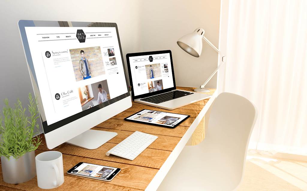
Images are also crucial. In addition to breaking up text and providing white space, they can also serve as examples to support your content or an additional format for users to absorb your information. Some people like words while others like pictures, and a mix of both is key to a user-friendly website.
Take a look at these examples from Health.com and National Institute of Health. Which one is easier to read?
Encourage Visitors to Take Action
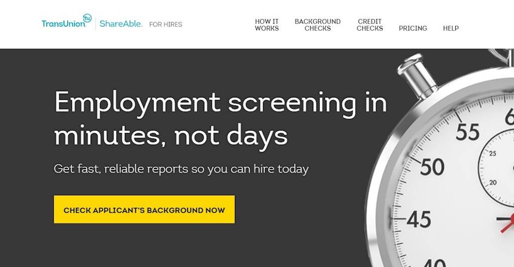
When someone visits your website, you hope to convert them into a customer. Make it easy for visitors to take the desired action by making it obvious how they should do it. TransUnion’s ShareAble for Hires is a great example of this: they have a call-to-action button that says precisely what they want the user to do.
Other call-to-action text may include phrases like ‘start here’ or ‘try now’ placed throughout your site at logical points in the user journey. However, do not overuse these calls-to-action, as too many may come across as spammy or distracting to your visitors. These buttons should follow the guidelines outlined above for maximum user-friendliness; high contrast colors, readable font, and clear and concise language.
Even young, tech-savvy consumers are likely to avoid your website if it is difficult to use, and the loss of conversion increases as you move into demographics that are less comfortable using online platforms. Speed and efficiency are key, and you should do everything you can to guide your visitor to the end goal. Visiting a website should not feel like an escape room with puzzles to solve - it should be as simple as a walk in the park.
Access the latest business knowledge in Marketing
Get Access

Sophia Conti
Sophia Conti is a contributing editor at 365 Business Tips, a new blog that curates the best ideas and information for small business owners. She specializes in helping businesses improve their customer experience and support.


Comments
Join the conversation...