
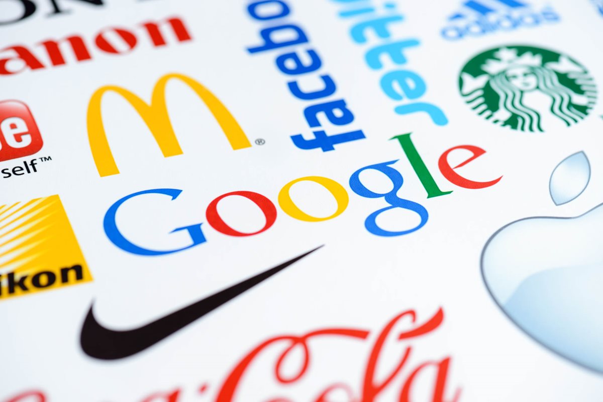
Some brand logos are etched into our memories forever, such as Starbucks, McDonald's, Apple, FedEx, Microsoft, Pepsi, Nike, Coca-Cola, Google and Amazon. Why are these brands successful when so many others fail? Believe it or not, there is a secret to success when it comes to the design of a company logo. Here are the 5 rules you need to stick to:
1. They’re simple
One of the goals of a catchy logo is simplicity. The color, typeface, design and other features very much matter and often appear similar to other logos. Most successful brands don’t have more than two colors in their design to keep from too much complexity. Shell is a good example of using bright red and yellow colors to attract attention. Many brand simply opt to use only one color. Consumers are far more capable of remembering a logo that is simple.

2. They’re shaped right
The shapes and dimensions of a logo make a critical impact. According to Forbes, flat designs are generally more successful than complex designs. Google and Microsoft are ideal examples. But if you do choose a beveled design, use Volkswagen and BMW for inspiration. And, when looking at the 50 most admired companies, many of these businesses use rectangles far more frequently than any other shape.

3. They’re consistent
The consistency of the brand must be apparent and unwavering. If a logo on a sign is different from the merchandising logo or the website logo, the brand will not achieve the exact look they want, nor will they be remembered easily. This will also help consumers to easily find your package on the shelf and choose it over your competitors’ in mere seconds.
4. They reflect the product
In some way, the logo should reflect the product you are looking to sell. Consider Apple. Their original logo had Isaac Newton under an apple tree with the words “Apple Computer co.” on it. Their newer and more successful logo is simple and sleek, just as they strive to make their products. The logo is consistent with the message of the brand. If you are a restaurant, you wouldn’t use a jackhammer as your logo, but rather the outline of a fish to demonstrate your product.

5. They’re memorable
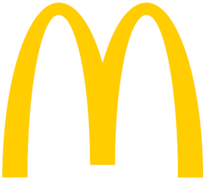
A logo should also be memorable. And to accomplish this, it needs to be simple and easy to recall. McDonald’s golden arches are a perfect example of a logo that stays in the mind and stands out from other brands.
It is important to note that you can follow all of these steps and still not be as successful as your competitors. Your logo must represent a product and service that equates to quality alongside a consumer desire for your products. If you have a terrible product or service, your logo won’t help. However, if you have a superior product and good customer service, a high quality logo can only help your brand loyalty and long-term success.
Access the latest business knowledge in Marketing
Get Access

Austin Winder
I'm Austin Winder, a Public Relations Specialist and contributing author for Sticker Mule. I live in Memphis, TN and graduated with a business and marketing degree from the University of Memphis.


Comments
Join the conversation...