


Email marketing is one of the best ways to connect with new, old or prospective customers but is your current approach making the right first impression? How your email marketing campaigns are designed could hold the secret to their success, ensuring recipients engage with it rather than banish it straight to spam.
But how do you improve your current design? Here are 20 email designs to give you inspiration and make you drool:
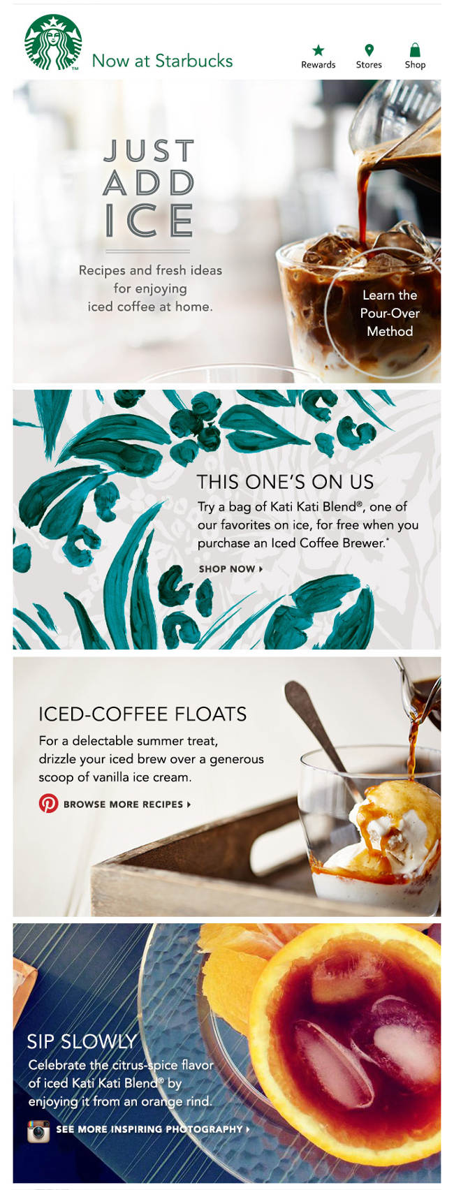
Starbucks
Known for their excellent content marketing, and social accounts, there’s no surprise that Starbucks have made it into our email marketing list.
The coffee giant conveys a lot of information in this newsletter template but the well-considered layout prevents it from being overwhelming or looking cluttered. Instead, it uses bold colors alongside simple text to get its message across.
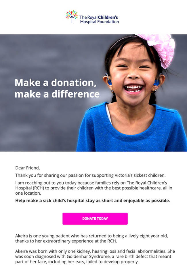
The Royal Children's Hospital Foundation
Emotive advertising is a big element of marketing and this design is a beautiful example. With a photo of a smiling child with a hearing aid and the tagline 'Make a donation. Make a difference', this template is used to communicate emotively with the Foundation's audience.
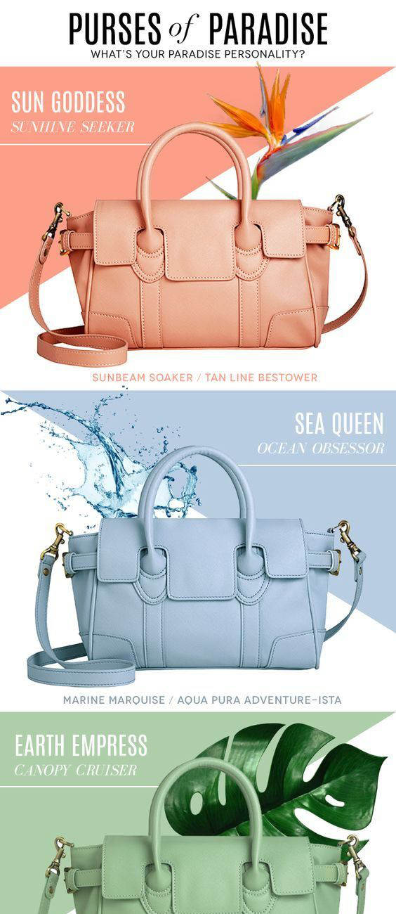
Purses of Paradise
Purses of Paradise opt for a more personalized approach with this email newsletter, inviting consumers to find out what personality they are and what product would best suit them. The pairing of products with colors also allows for a cohesive but eye-catching design.
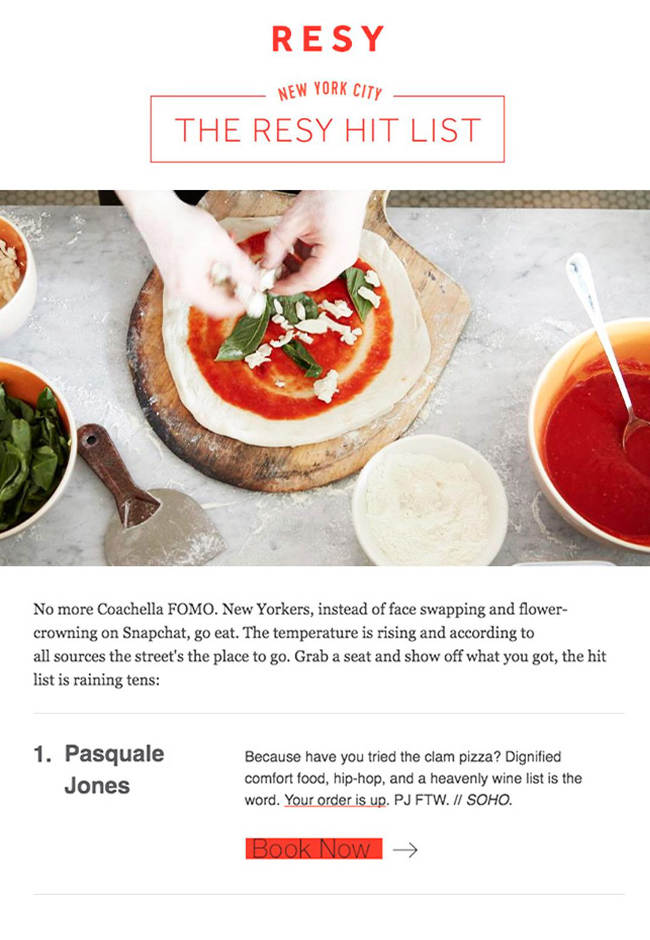
Resy
Resy connects foodies with the best local restaurants and this simple design allows the food to be the star of the show. Understanding its audience, it entices its readers in with concise text that speaks directly to the demographic.
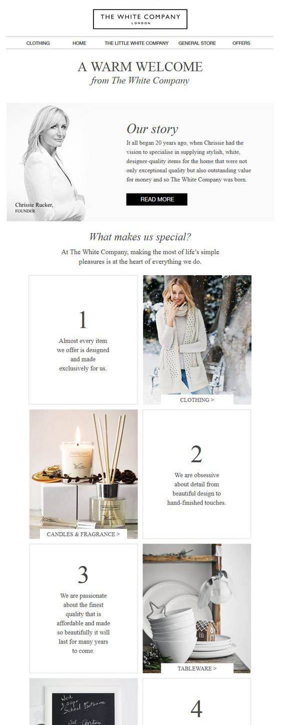
The White Company
Unsurprisingly, white is the dominant color for the White Company's campaign, allowing the fairly extensive text to stand out. This welcome email ensures all new customers understand the brand and what it stands for.
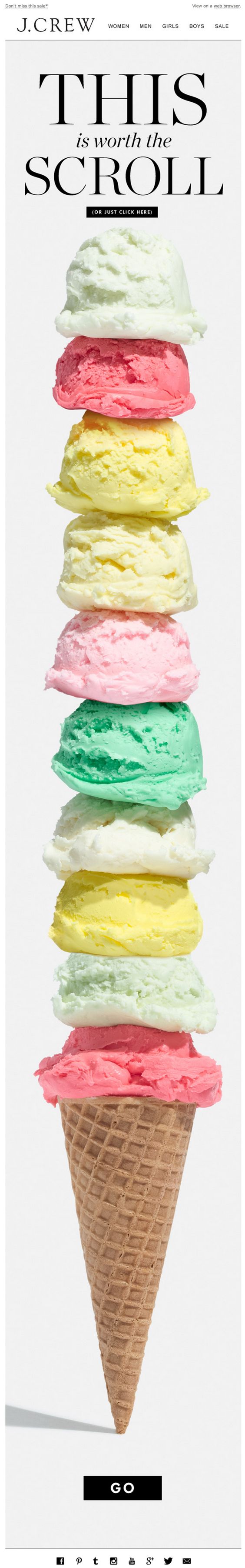
J.Crew
A picture can say a thousand words and J.Crew are counting on it with this email design. There's barely a sentence but there is a massive ice cream cone with rainbow-colored scoops. It's a fun and quirky idea that stops readers in their tracks and keeps them scrolling.
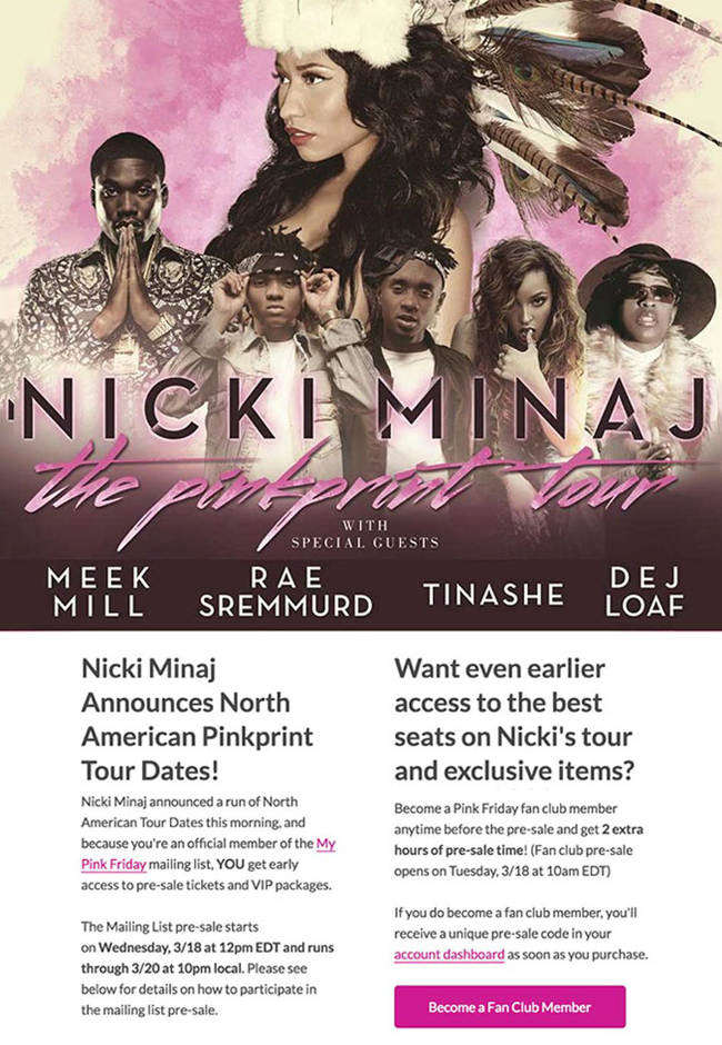
Nicki Minaj
This bold design that singer Nicki Minaj uses to connect with her fans is the perfect example of how brands can showcase their personality in email marketing.
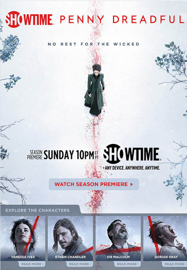
Showtime
Showtime uses email marketing to get its audience excited for upcoming season premieres. This design for Penny Dreadful showcases the show’s dark tone and its contrast between white and red ensure it's not going to be missed.
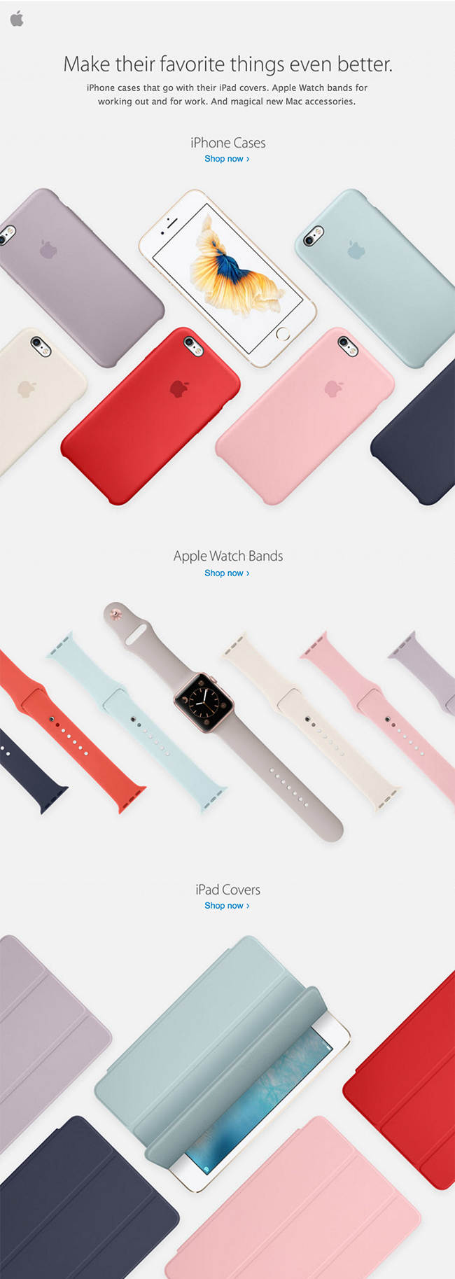
Apple
Simplicity is an intrinsic part of Apple's brand and you can see why it's so effective with this minimalist-inspired design. This email marketing campaign allows the products to do all the talking and showcases the design of them.
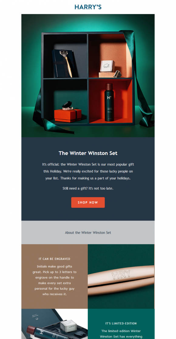
Harry's
Harry's email design highlights how seasonal colors can be used to engage consumers and help them better understand your brand.
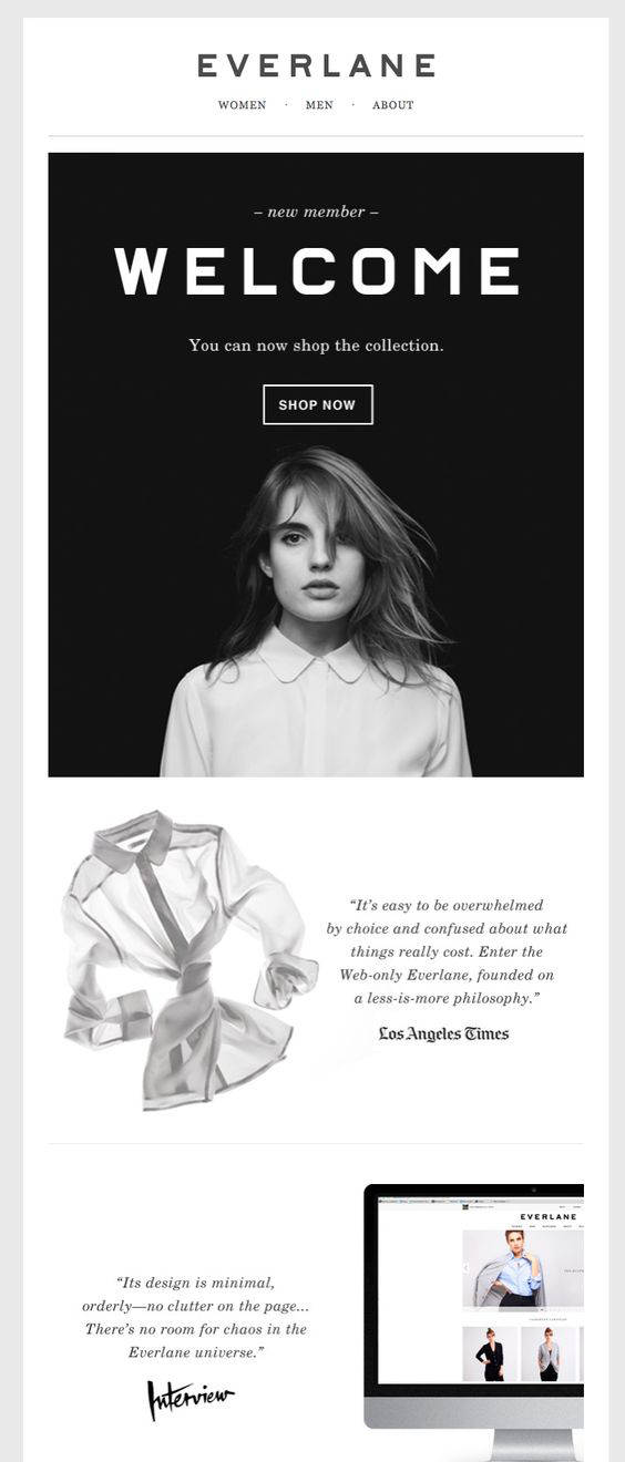
Everlane
Monochromatic design is one of the oldest but also one of the best. This complements Everlane's brand ethos of ‘less is more’ and makes the CTA the main event.
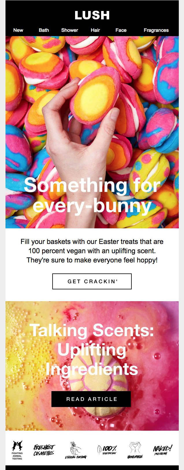
Lush
As with all Lush advertising, the brand uses bright and bold colors in its emails to attract and keep its loyal fan base. Understanding its customers, there's also space at the bottom to showcase its brand beliefs, such as '100% vegan' and 'against animal testing'.
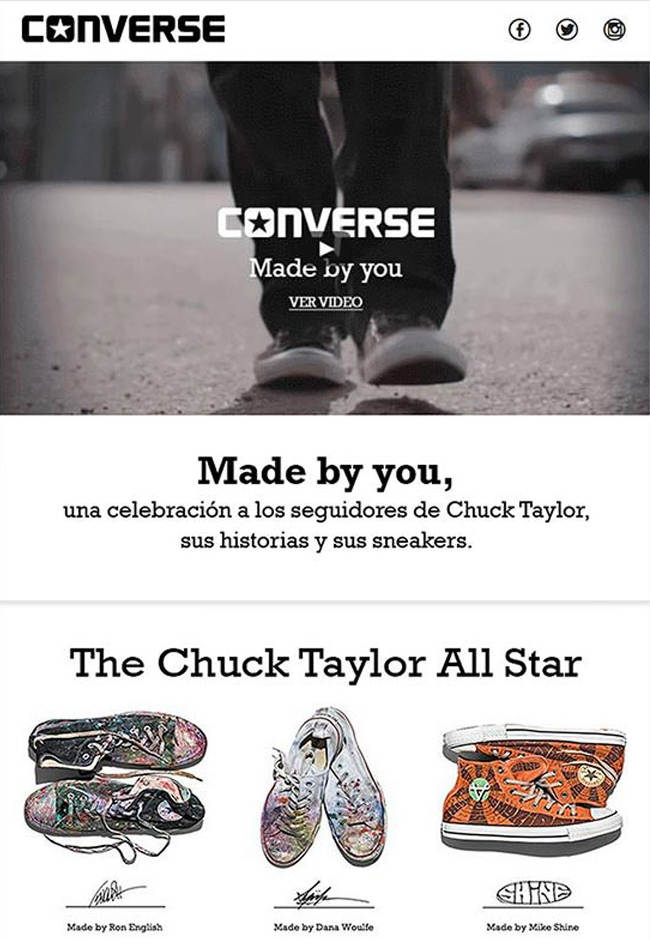
Converse
Many brands are proud of their history and Converse uses video content embedded in their email newsletter to highlight theirs. They also use signatures across the bottom to embody their heritage and add authenticity. As there are so many styles to choose from and so many ways to customize their products, Converse leverage this element of personality in all their marketing, emails included.
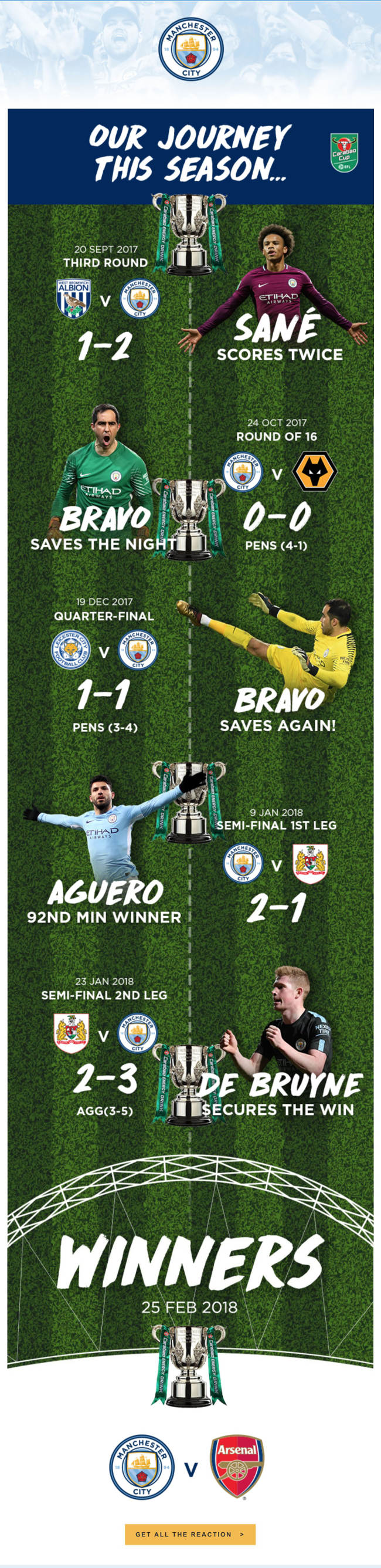
Manchester City FC
Sports fans are some of the most dedicated in the world and that means they like to get all the insight about their favorite team and players. In its email marketing campaign, MCFC uses an infographic-style template to give fans all the upcoming information they need in an easy-to-read format.
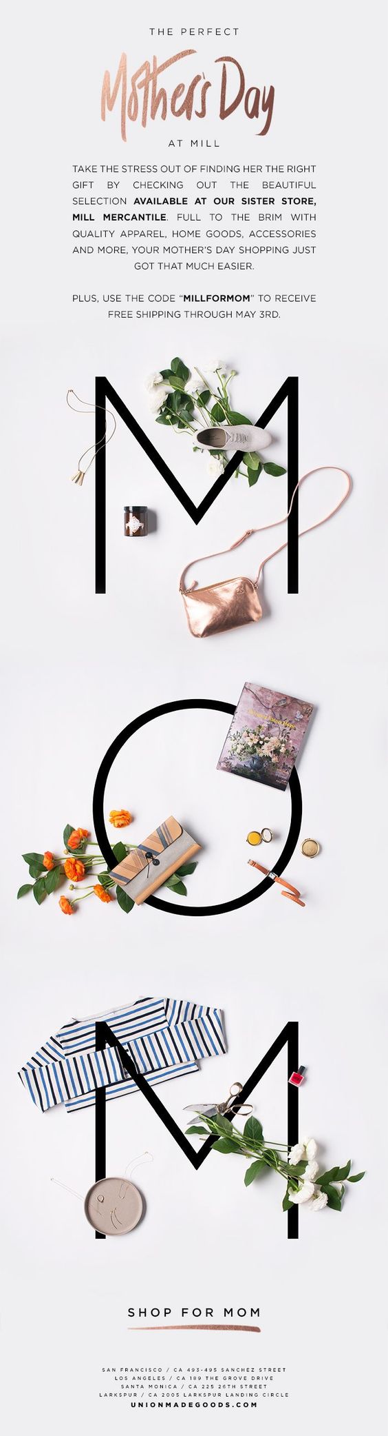
Union Made Goods
Perfectly balancing white space with bold colors and typography, this example showcases a wide range of products while maintaining a clear design.
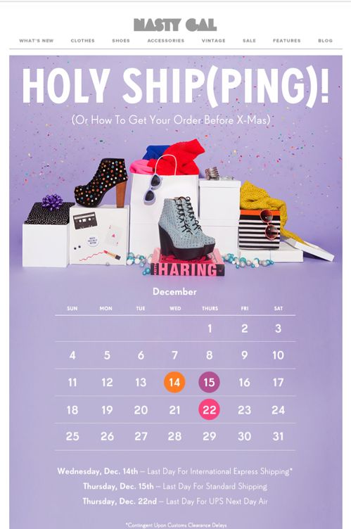
Nasty Gal
Making the most of its non-conforming image, Nasty Gal's pre-Christmas email marketing template incorporates humor to make itself stand out from the crowd. Not only does this email seem like a really simple idea, it creates an urgency for customers to purchase in time of the shipping deadlines and encourage action on those abandoned baskets. Coupled with the muted background color prevents it’s both effective and aesthetically pleasing.
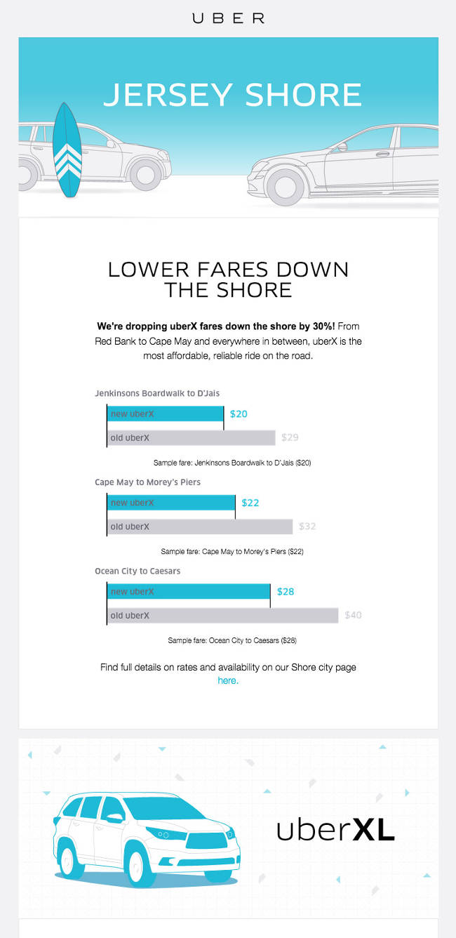
Uber
Graphs and charts aren't just for your company presentations but can actually be the focal point of your email marketing material as shown by this example from Uber. It effectively communicates what could have been fairly boring information and allows customers to clearly see how much money they're saving.
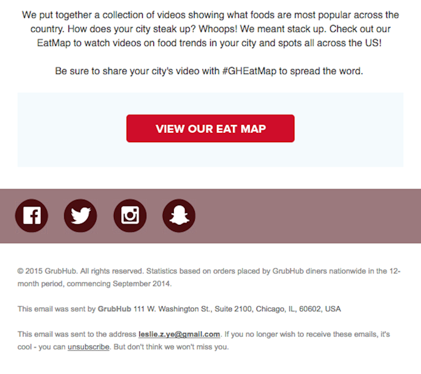
GrubHub
A colorful GIF takes main stage in this email template from GrubHub, which allows it to position itself far away from the dry, boring product promotion many consumers are tired of. It also provides a useful link to the interactive 'Eat Map' to personalize the journey and get on top of local food trends.

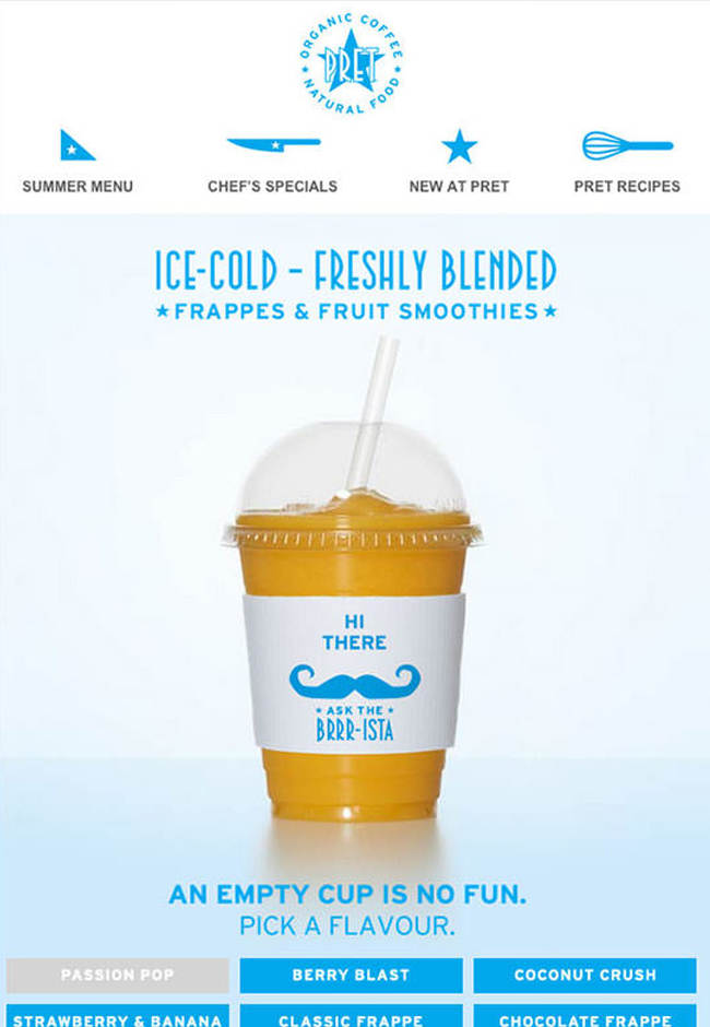
Pret
Pret prides itself on the fresh quality of their produce and this email template is built around the cafe chain’s summer menu.
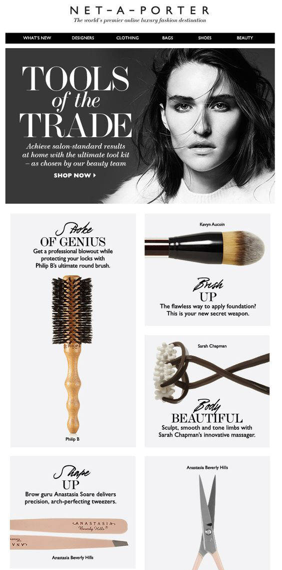
Net-A-Porter
Email marketing should clearly communicate your brand to its audience and Net-A-Porter exude their luxury, hand-picked vibes in this campaign.
Access the latest business knowledge in Marketing
Get Access

Marketing Insights for Professionals
Insights for Professionals provide free access to the latest thought leadership from global brands. We deliver subscriber value by creating and gathering specialist content for senior professionals
![Are We Getting Better at Email? [Infographic]](/getmedia/e49f1bfd-df4f-4904-89bd-970dde11219c/are-we-getting-better-at-email.jpg?maxsidesize=350&resizemode=force)

Comments
Join the conversation...